On September 8, a company called Thesys released a model whose only job is to draw interfaces. It's called OUI-1, it's small enough to run on one consumer graphics card, and its makers set the bar in plain terms: an interface should appear in under a second, on your own machine. Less than a year earlier, Google Research described its own generative UI system as sometimes taking "a minute or more" per answer.
That's a fast trip from research demo to a dedicated model with a benchmark. It also means the phrase "generative UI" now gets stuck on almost anything: a chatbot that returns a weather card, a design tool that spits out a mockup, a model that writes a whole web app from scratch. When a term covers everything, it stops telling you anything. So here's the definition we work from, and why we think the most important part of it is the part people skip.
A definition with three moving parts
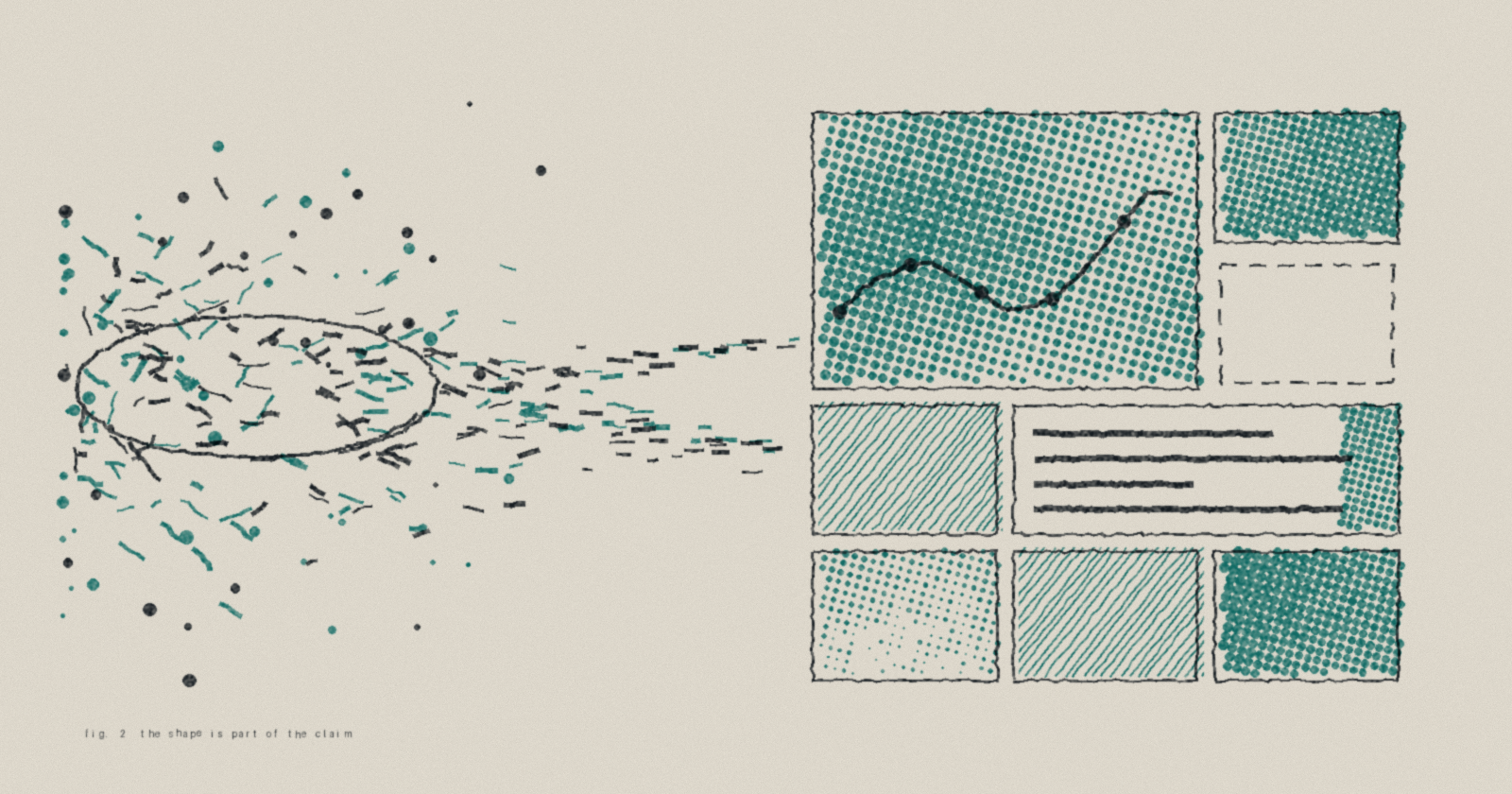
Generative UI is an interface whose shape is decided at the moment of need, from what the person is trying to do.
Three phrases in that sentence do the work. Shape means the structure itself (is this a table, a map, a timeline, a form with a confirm button?) and not only the words inside it. Moment of need means nobody designed this particular screen in advance; it exists because you asked, and it may never exist again in quite this form. And intent means the input is a goal, not a click on a menu somebody else arranged.
The easiest way to see the definition is to look at what falls outside it.
A chatbot is not generative UI, even a very good one. The answer changes every time, but the shape never does: a column of text, growing downward. Ask it to compare four laptops and you get four paragraphs, which you then turn into a table in your head. An ACL 2026 paper measured what happens when a model answers with a purpose-built interface instead, and reported up to a 72% improvement in human preference over the chat baseline. Chat is a fine shape for conversation. It's a poor one for comparing or planning anything with more than two dimensions.
A templated interface isn't generative either, however dynamic it looks. A dashboard that fills its slots with live numbers was still designed by someone months ago who guessed which slots you'd need. The data is fresh. The decision about what matters is old.
And AI bolted onto an app isn't it. A sparkle button inside a spreadsheet can write formulas for you, but the spreadsheet still decides what the world looks like. The model lives in a box a designer drew for it.
A spectrum, not a switch
Inside the definition there's a real range, and the industry has started naming it. A June report from Thesys sorts the approaches by how much the model is allowed to decide, from picking prebuilt components at one end to writing raw web code, capable of anything a browser can show, at the other. Google's A2UI project sits in the middle, with a declarative catalog. MCP Apps, now an official extension to the protocol many agents use to reach their tools, leans toward the open end: tools can ship their own web interface, rendered in a sandbox.
People usually argue about this spectrum as a question of creative freedom. More freedom, more expressive screens; less freedom, more consistency. Google's own write-up of the trade-off lists the cost of the open end in almost comic terms: "clashing design systems or redundant scrollbars."
That's real, but we think it's the smaller question. The bigger one is who's accountable for what the screen claims.
Why a table can lie in ways a paragraph can't
A paragraph that says "these three flights are the cheapest" is making one claim, and it reads like one. A table with three rows, sorted by price, with a column of airline logos, is making the same claim with far more authority. It looks like it came from a database. Layout is rhetoric. The moment a generated answer becomes a generated interface, every structural choice turns into an assertion: that these rows exist, that this number is the important one, that this button does what it says.
We learned this in the most direct way possible. Beacon lets you draw on the workspace, and a few weeks ago someone sketched an empty table, just column headings, and asked for help with it. Beacon filled it in. Neatly, confidently, with data that did not exist anywhere. Nothing was wrong with the drawing. What was wrong was that the system had quietly treated a drawn shape as evidence that its contents were real. A sketch of a table is a request for a table. It isn't a table.
The fix wasn't a better prompt. It was a stance we now hold everywhere: something that can't be backed by a real source doesn't get rendered as fact. It gets shown as a gap, labelled as one, and the system goes back to look again. Stated without the plumbing: deciding what's true and deciding how it looks are separate jobs, and the part that draws shouldn't be able to invent anything. A generated interface that's occasionally fictional doesn't make the computer faster. It makes it slower, because now you have to check everything yourself.
This is also why we treat the arrangement of the screen as a claim worth getting right. In Beacon, a panel that matters more is bigger and closer to the middle, and something that didn't clear the bar for relevance isn't shown at all. That's a strong opinion, expressed spatially, and it needs to be as honest as the words.
The controls are generated too
There's a quieter half to the definition that recent research keeps pointing at. A generated interface decides what you can do next, not only what you can see.
A UIST 2026 paper on what its authors call malleable prompting takes preferences people usually type out, like tone or emphasis, and turns them into sliders and toggles that steer the model directly. Participants hit their targets more precisely and described the result as more controllable than prompting alone. Another August paper, LEGOUI, goes after the black-box problem from the design side: it records each design decision the generator makes and lets a person accept or reject them one at a time instead of rerolling the whole thing.
Both describe something we've run into ourselves. The best moments in a generated interface are the ones where it hands you the right lever: the confirm step before anything irreversible, the follow-up offer you were about to ask for. When it gets that wrong, the screen looks finished and you have no idea how to change it.
What's still hard
Plenty. Speed is the obvious one; a screen you wait a minute for has to be very good to be worth it, which is the gap OUI-1 is aimed at. Consistency is another. An August field report on MCP Apps found that when the host and the tool don't both declare support, the tool still runs but falls back to plain text, and to the developer it looks like a rendering bug. Multiply that by every host drawing things its own way and you get a system where the same answer wears a different face depending on where you asked.
And there's a problem nobody has solved, including us. People learn software by repetition. You find the export button once and your hand remembers where it is. If every screen is new, what exactly does a person get better at over time?
We don't think the answer is to stop generating. We suspect it's closer to a house style strong enough that new screens still feel like the same place. Does that hold once the screens stop being demos and become someone's ordinary Tuesday? The whole field is about to find out, us included.
If you'd like to try an interface that gets assembled around what you ask, Beacon is at studioaices.com/download.
Further reading
OUI-1: an open-weights model for generative UI, Thesys, September 2026
MCP Apps in 2026: What Actually Shipped, Host by Host, Dani Reyes, August 2026
From Words to Widgets for Controllable LLM Generation, Zhang et al., UIST 2026
LEGOUI: Designing with UI-DSL Bricks to Balance Transparency and Controllability, Zhou et al., August 2026
Generative Interfaces for Language Models, Chen et al., ACL 2026 Findings
The State of Generative UI in 2026: Transports, Formats, and Tradeoffs, Thesys, June 2026
A2UI + MCP Apps: Combining the best of declarative and custom agentic UIs, Google Developers Blog, June 2026
Generative UI: A rich, custom, visual interactive user experience for any prompt, Google Research, November 2025